Product added to cart
Colours are both subjective and versatile. It is the way we use them that creates great design, to define an atmosphere and carve character.
Read the ArticleCreating an account has many benefits: check out faster, keep more than one address, track orders and more.
Blue. The colour of the serene sea waves, a welcomed vision of morning skies and the worlds favourite colour.
It was the ancient Egyptians who created the first blue pigment; the evolution of blue over the next 6000 years sees decorative adornment worldwide. Throughout the last millennia we have seen a rainbow of blue as symbolism in artwork. Many of us can picture a few of ‘the greats’: Blue Water Lilies by Claude Monet, Van Gogh’s Starry Night and works from Pablo Picasso’s famous ‘blue period’ to name a few.
The famous artist Yves Klein worked near exclusively with blue so much so that he developed the eponymous International Klein Blue. Mark Rothko also chose blue for his most earnest artworks. There is even debate in the art world whether Kandinsky’s Blue Rider did in fact lead ‘The Blue Rider’ art movement – Kandisky believed blue to be the colour of spirituality: the darker the blue, the more it awakens human desire for the eternal.
Whilst at one point in history blue was a tone of torment in artwork, today it more so resonates relaxation and feelings of freedom, thanks to the association to the natural world.
Trickling through the ages we still have a love of blue that transpires across all aspects of the design world.


We saw blue shades named both Pantone and PPG’s Colour of the Year for 2020 and the trend for blue is set to last as long as the lapping waves it represents. With earthy tones a trend to gain traction in 2021 alongside biophilic design ever on the rise, bold blues are hues here to stay.
Misty Aqua is the colour choice for PPG in 2021; whilst in an ever-increasing digital world, WGSN nominated AI Aqua as the key colour for digital in 2021. LinkedIn, Twitter, Facebook and Skype are all brands and logos we interact with daily which lead to subliminal trust and create an association of connection.
From technology to fashion and interiors, trends across each sector are interlinked as they are all derived and diluted from shifts in human behaviour. Year on year blue is incorporated into fashion colour palettes and blue equally remains a go-to within interiors, whether they be inky walls or sky-shade seating.
Some of us connect to dramatic inky tiles on the walls. Others find less saturated sanitaryware shades charming. Whilst others prefer pastels on the patio. We all imagine a different shade when picturing blue in our minds eye and we all have a favourite shade, from nostalgic minty pale shades to uplifting regal blues. Yet a question remains for many – how do we design with blue?
With warm to cool and muted to bright colours on the spectrum, blue is an incredibly versatile colour with a plethora of possibility. Here we explore some of our favourite solutions for indoor and outdoor designs.
When I was a designer in the 1990s, we always had to include blue because it sold, but it was never pin-pointed as a fashion colour. Whereas now, I think it's coming through as a statement colour – the tone of Aqua AI is a lot more digestible for most people.
Jane Monnington Boddy
Director of Colour at WGSN
We bring you an array of products for inspiration. From royal blue taps and indigo blue soap dispensers to muted blue basins, not forgetting an array of blue tiles, you can design with blue for creative commercial solutions to impactful powder rooms alike.
Dolphin offers RAL colouring for many products, allowing you to create a coordinated scheme from paper dispenser to mixer tap. We have seen specification featuring colour in projects such as primary schools to luxurious lavatories in lobbies. For residential projects coloured furniture is popular whilst blue tiles and slabs are favoured throughout the home.

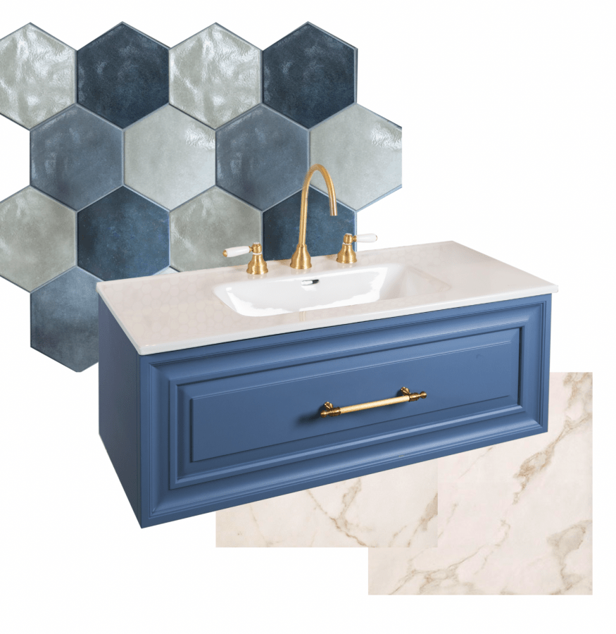
A French Country Chic scheme for residential designs can be met with the newly launched Bermuda Blue Biarritz unit complete with Zanzibar handle and brassware. Blue tiles will accentuate the vanity unit whilst the Zanzibar brassware emphasises earthy tones of Carrara marble effect tiles – whilst coordinating perfectly to the handle.

Tiles create both the first impression and overall ambience in any room, hence a great place to start your design journey. With hundreds of tiles on offer – and as a keen trending colour – blue tiles offer the widest choice of colour and pattern for blue hues.
It’s also important to play with your colour palette in moodboard form; exploring different brassware finishes with different tiles to see how the colours communicate with eachother. Pick out darker tones of terrazzo patterned tiles by pairing with Matt Black. Contrast the minty iridescent tones of 41Zero42’s Spectre tiles with Brushed Copper. Keep it industrial with a Brushed Nickel against Del Conca’s Seventy Nine concrete-come-carpet effect tile; or create a grecian vibe with Zanzibar brassware as golden as the sun gleaming against deep ocean blue tiles.
Blue sanitaryware also offers incredible versality: Industrial, contemporary and classic schemes can all be met with the same Galassia Core Petrol Blue basin.
The Del Conca Timeline slab features a concrete-come-carpet print; the rustic charm of such a pattern pairs perfectly with an industrial Jee-O mixer in Matt Black.
On the colour wheel blue and orange are complimentary colours, resulting in an automatic match. Our Brushed Copper brassware in Princess Nouveau offers charisma to classic schemes.
With the cool tone of the Petrol Blue basin, Brushed Nickel brassware also works equally well. We love how the Brushed Nickel Toko contrasts against the blue on blue scheme. Which is your favourite?
Colours that replicate those found in nature are scientifically proven to help us reduce stress, and naturally these tones work wonders in the great outdoors.
We can all picture the eponymous shade ‘Aqua’. A gleaming swimming pool of joy and a colour automatically associated with an escape to the Maldives – perhaps with the global travel restrictions during Covid-19 this is why we see such craving for this colour. The jewel-like turquoise shade is uplifting in any space and works incredibly well in outside spaces. It complements the inviting blue of a swimming pool and brightens up the back garden. Yet it equally injects life to hotel outdoor areas, from bars to balconies, thanks to this near nostalgic colour offering a sense of playfulness.
With colours becoming a frequent request in order to brighten up beige patios, many suppliers are expanding their palette of choice, from the Lotus Daybed to Varaschin deck chairs.


