Product added to cart
In the wake of an unprecedented year as the pandemic loomed large and lockdowns came into force all around the globe, it’s no surprise that we’re more than ready for a change of pace and, after months of uncertainty, actively looking for ways to lift our mood.
Having spent more time at home than ever before over the past 12 months, all indications show that consumers are experiencing a renewed appreciation for their home comforts. This has, in turn, catalysed an upsurge in interest in upgrading our personal spaces. According to a recent survey, more than half of shoppers in the United Kingdom are planning to invest in outdoor living products post-lockdown, with 47 per cent intending to splash out on new home décor.
As we collectively emerge from shelter-in-place hibernation and vaccination rates ramp up, we’re not only focused on getting out and about but we’re also starting to feel increasingly optimistic about the future. And how better to channel this more positive outlook than with a splash of zingy colour or, for areas created for cocooning, by setting a restful tone with soothing shades?
Energy-Enhancing Effects
By evoking the therapeutic power of colour, we can inject more joy into our lives, dial up the drama, and demark zones where we can disconnect.
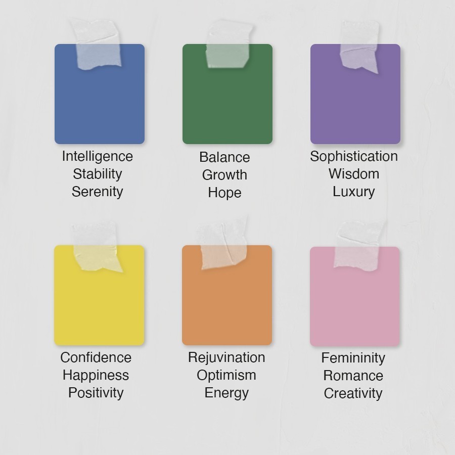
Surrounding ourselves with colours that deliver a positive energy-enhancing effect has never been more important. Research shows that colour has an impact on both psychological and physiological health and wellbeing; warm colours, such as pink, yellow and orange, can trigger feelings of comfort and warmth, while cool colours, such as green, blue and purple, promote calmness and relaxation. The colour green is also associated with nature and, particularly for urban dwellers without immediate access to gardens, parks and other greenscaped outdoor spaces, can be used to beneficial effect inside the home.
The bathroom is the perfect space to start to experiment with colour. The sanctuary at the heart of the home, the bathroom is a place where you can relax, recharge and escape from the realities of the day, and it is the one space where we can be sure to find solitude, space, and privacy. Adding colour can have a significant impact on not only the aesthetic appeal, but also how you feel whilst in the room.
With the resurgence of coloured sanitaryware comes the opportunity to show off your more playful side. Gone are the days of the ubiquitous avocado bathroom suite with matching fitted shaggy carpet – today’s coloured sanitaryware is less of a retro revival and more of a sophisticated evolution. From candy colours to bold brights, our bathroom spaces are ready to be revitalised.
Let the (Sun)Light In
Interiors trends tend to reflect the predominant socio-economic forces, which can be clearly seen in this year’s global colour trend predictions. In particular, global colour authority Pantone’s 2021 trend outlook perfectly captures the collective mindset as we glimpse a glimmer of light at the end of the pandemic tunnel. Opting for a dual selection for only the second time in the company’s history, ‘Ultimate Gray’, a robust shade of stone, paired with vibrant sunshine hue of ‘Illuminating’, brilliantly combine a sense of strength and solidity with a cheerful wave of optimism.


Make a bold statement with the Core basin in Ocher by Galassia. Pair with the sleek Toko tall mono mixer, which echoes the basin’s sculptural lines, and complement with an Alpine counter in soft beige slab tiles – the perfect understated backdrop against which the basin’s sunny yellow hues draw the eye.
The Dream countertop wash basin in an Ocher shade is a major focal point that combines a playful sense of eclecticism with incredible versatility.
Yellow and white is a bright and light colour combination that’s guaranteed to lift your mood in the morning. Keep it fresh and modern with the Hex 25 tiles by Johnsons in Dandelion and Natural White; get creative and mix it up for a unique pattern in line with your individual aesthetic. For a fun vibe, cover the walls with this hexagonal design in alternating yellow and white shades.
Take modern monochrome to a new dimension by pairing the on-trend yellow basin with the industrial-styled Revolution tall mixer in Matt Black, with a soft grey slab tile for texture. For those appreciative of a more daring design, richly patterned tiles – such as CIR’s Showall or Sant’Agostinos’s Fun tile – can be configured to create a visually interesting heritage or Mediterranean vibe.
01
Showall W08 Garden
03
Showall W05 Mahori
1
Go Green
The sleek lines of the Koy Round Countertop Wash Basin in a deep Matt Green works beautifully for a relaxing biophilic bathroom retreat. Keep the natural theme going with brassware in a rich copper hue, such as the elegant Velis mono basin mixer in Red Canyon PVD by Nobili or Bagnodesign’s M-Line in Brushed Copper. Top it off with organic textures and a patterned leaf print with the CIR Showall Garden or Myfair tiles. To dial up the warmth, go for beautiful terracotta-toned tiles; we recommend the Old Chicago Matt, also by CIR.


For a softer look, Galassia’s Core basin is also available in Sage. This gentle shade of green gives the contemporary Scandi aesthetic a new twist. Keep it light with a Zanzibar or PVD Gold finish across brassware and accessories –the sculptural lines of the Toko mixer adds an elegant flair – while the Alpine countertop offers practical storage that also delivers robust aesthetic impact. For the walls, FAP’s Summer tile range pairs perfectly for a pulled together look.
Rediscover an enduring design classic with the uplifted small format metro tile; a rich and varied colour palette combined with new finishes such as matt, bevelling, and crackled glazes brings new life to industrial-styled kitchen and bathroom aesthetics.
Delivering the same level of aesthetic impact, patterned tiles are a more practical alternative to traditional wallpaper – particularly in more humid climates where less robust wall coverings are prone to peeling – whilst offering a lower-maintenance alternative to marble. For a rich decadent luxe look, the Fioranese’s Sound of Marbles collection in green onyx dials up the drama, while a understated vibe can be achieved by opting for a more monochrome palette shot through with a fine green vein for added interest and texture.


In the Pink
Pink is fast emerging as the new neutral, offering a fresh perspective on the standard cream, beige and ubiquitous whites that have reigned as foundational colours for the interiors palette for over a decade. Opt for soft candy pinks and pink-toned pales as a versatile backdrop that works to add a subtle warmth to any area of the house, from the bathroom through to the kitchen. Terracotta and salmon tones also add earthy warmth without being overly sweet.
Solid pink in a soft, muted shade works beautifully in the form of a tiled wall for a warm but unobtrusive backdrop. Add interest with a clever injection of texture, such as with these Passepartout tiles from Fioranese in Millenial Pink, to lend a subtle sense of style without overwhelming the space. This private apartment in DIFC, Dubai, which features the tile as central to its bathroom design, aptly demonstrates the power of understated pink-hued elegance.
We may not be able to jet off to tropical destinations right now, but we can certainly create gloriously maximalist interiors that channel our desire for far-flung adventures. Dial up the drama with the Showall Monkey from CIR featuring darker shades of forest green with pink and lilac tones. Pair with a Matt Pink Koy basin with Toko brassware in Gold or Zanzibar for added warmth. The round Monroe mirror adds contemporary flair or, for a dash of old-style Hollywood glamour, the sumptuously ornate Malabar Tri-Fold mirror is the ideal finishing touch.


For eye-catching impact that’s totally on-trend, pair pink with green or blue for a feel-good aesthetic. Sitting across from each other on the colour wheel, these colours are surprisingly complementary. For a softer look, opt for pastel shades such as mint or sage with sugar-almond pink. Terracotta tones also work beautifully with shades of green.
Pale pink and sky blue is a combination guaranteed to sweeten your mood; finish with Matt Black brassware for extra aesthetic impact. This colour duo works for walls as well, try the Cielo E Terra tile collection. Alternatively, add a dash of retro styling with the Futura for pattern that adds personality to modern spaces. Small format tiles are also perennially popular throughout the home as a stunning addition to any interior surface.
Blue Hues
Benjamin Moore Paint’s Colour of the Year for 2021 is Aegean Teal. Being calming whilst lending an air of richness and depth, this vibrant blue-green shade with grey undertones is the perfect colour complement for the cocooning trend. Crown Paints is also backing blue as its colour of the year, in this case opting for a soothing Powder Blue for a coastal feel, evoking feel-good memories of summer holidays by the sea.
The sleek styling of the Core basin in Petrol Blue pairs well with moody monochrome shades. Add interest by creating a patterned backdrop of small format tiles in shades of grey and white; try the CIR Materia Prima for coordinating blue hues.
The Biarritz Bermuda Blue offers a timeless traditional look. Pair with Malabar mixers and marble effect tiles for an eternally chic and sleek bathroom solution.
The new Revolution furniture, available in a rich jewel-toned Prussian Blue, is versatile enough to style across a range of on-trend aesthetics, from Industrial through to Japandi. The Kintsugi tile also scores high in the versatility stakes, blurring the lines between East and West, and working equally well with Classic and Contemporary looks.
01
Biarritz
02
Galassia Core Basin
03
Revolution
04
Revolution
1


For anyone feeling a little uneasy about diving head first into a world of colour, block colour accents are an effective way to channel the trend without making a wholehearted commitment. In an otherwise white bathroom, a section of blue floor tiles or a statement wall adds subtle depth and directs attention to specific features, such as a showstopping Koy Bagnoquartz bathtub. Try mixing white with grey to keep the same cool tone and balance out the flash of colour – the Timeline Seventy Nine or Picket Grunge small format tiles will add a softer industrial touch.
Be inspired. Dive deeper into the hue of blue with our dedicated blog.